Project Overview
Project: Learning Portal Landing page Redesign
Industry: Education
Date: 2023
Role: UX/UI Designer, Web Developer
Tools: Figma, Adobe Illustrator, VS Code, LibGuide
Problem: Information Overload and Lack of Hierarchy
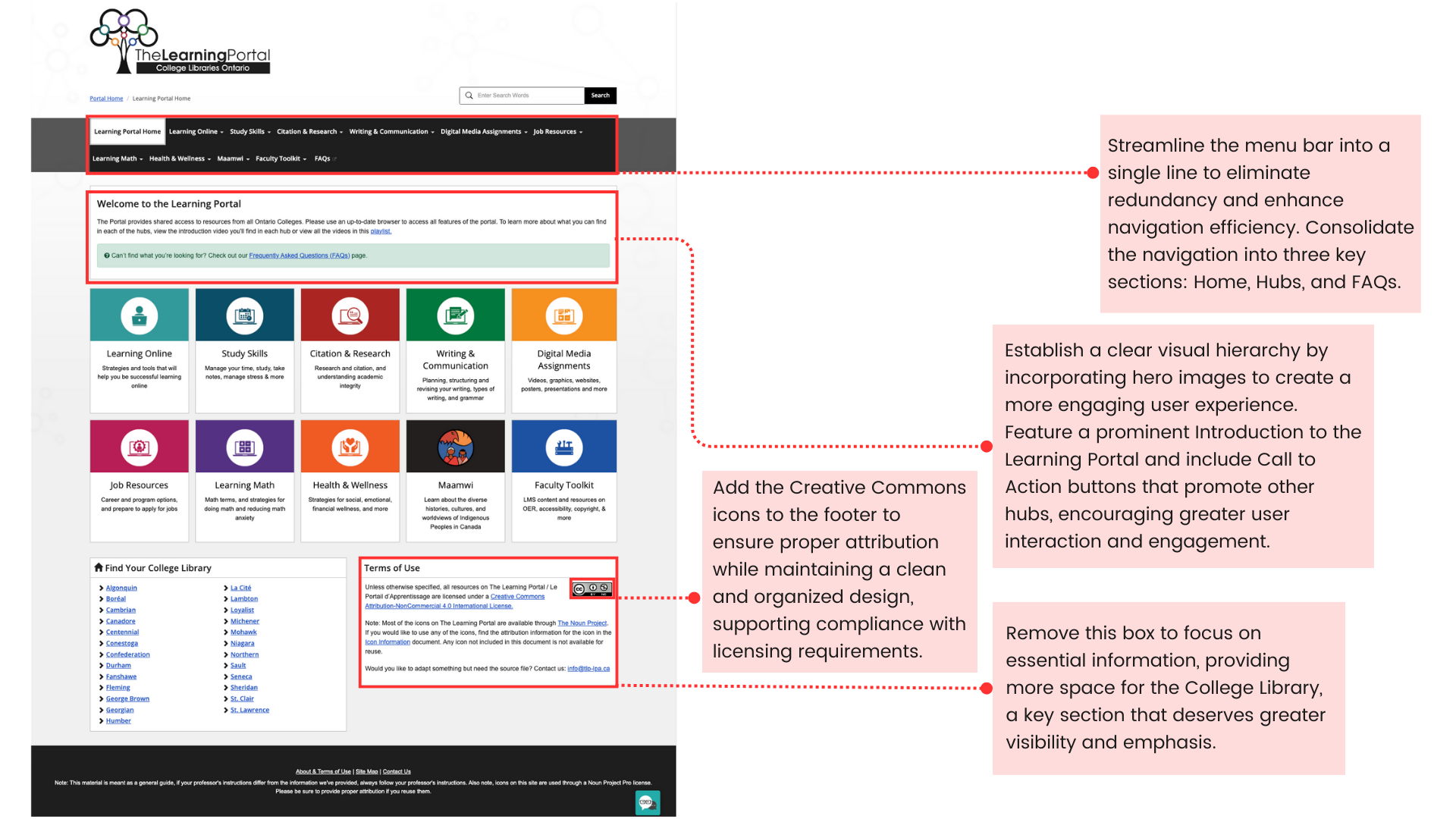
The previous Learning Portal landing page suffered from information overload, redundant content, and a poorly structured menu. Users struggled to navigate through dense blocks of text and faced confusion due to repetitive information, negatively impacting overall engagement and usability. The two-line menu added to the clutter, resulting in higher drop-off rates and reduced user interaction.
Overload of Text: The landing page was filled with excessive amounts of text, which made it difficult for users to quickly locate relevant information.
Repetitive Information: Multiple sections of the page repeated similar content, leading to user frustration and confusion.
Two-Line Menu Bar: The menu bar extended into two lines, contributing to visual clutter and making navigation less efficient.
Lack of Visual Hierarchy: Important content was lost amidst poorly organized sections, making it hard for users to prioritize or digest the information effectively.
Impact: User Confusion and Reduced Engagement
These problems created a negative user experience, resulting in:
User Confusion: The overload of text and repetitive information overwhelmed users, making it difficult to navigate and absorb the content.
Reduced Engagement: Cluttered navigation and a lack of clear visual pathways reduced user interaction with key resources on the page.
Navigation Difficulties: The two-line menu bar hindered users from finding the right sections, adding to their frustration and reducing usability.
Poor Content Absorption: Without a clear visual hierarchy, users struggled to grasp important content, lowering the portal’s overall effectiveness.
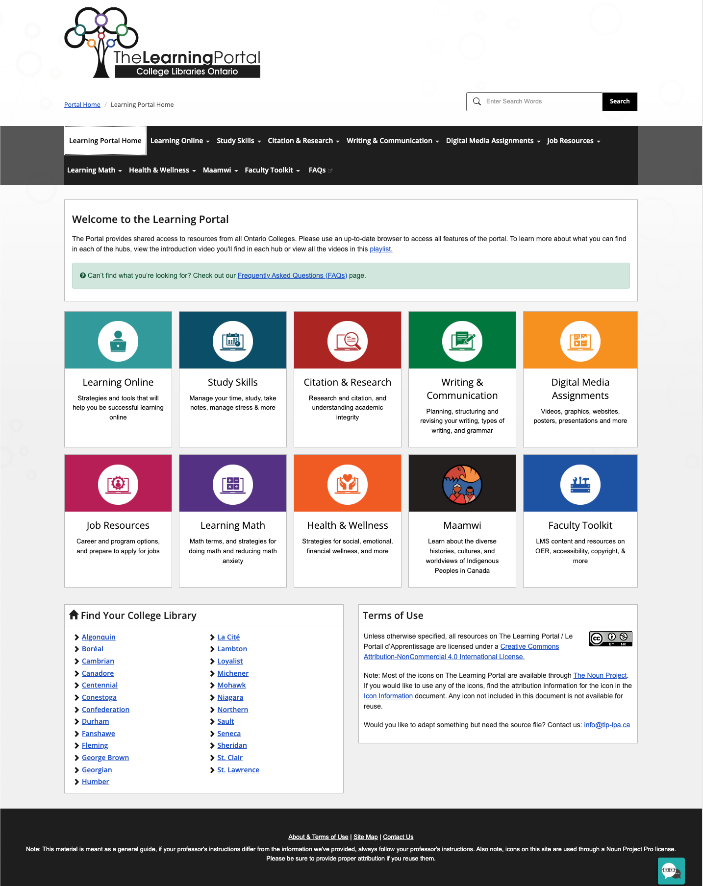
Solutions: Streamlined Navigation and Improved Visual Design
To resolve these issues, the redesign focused on enhancing both usability and aesthetics:
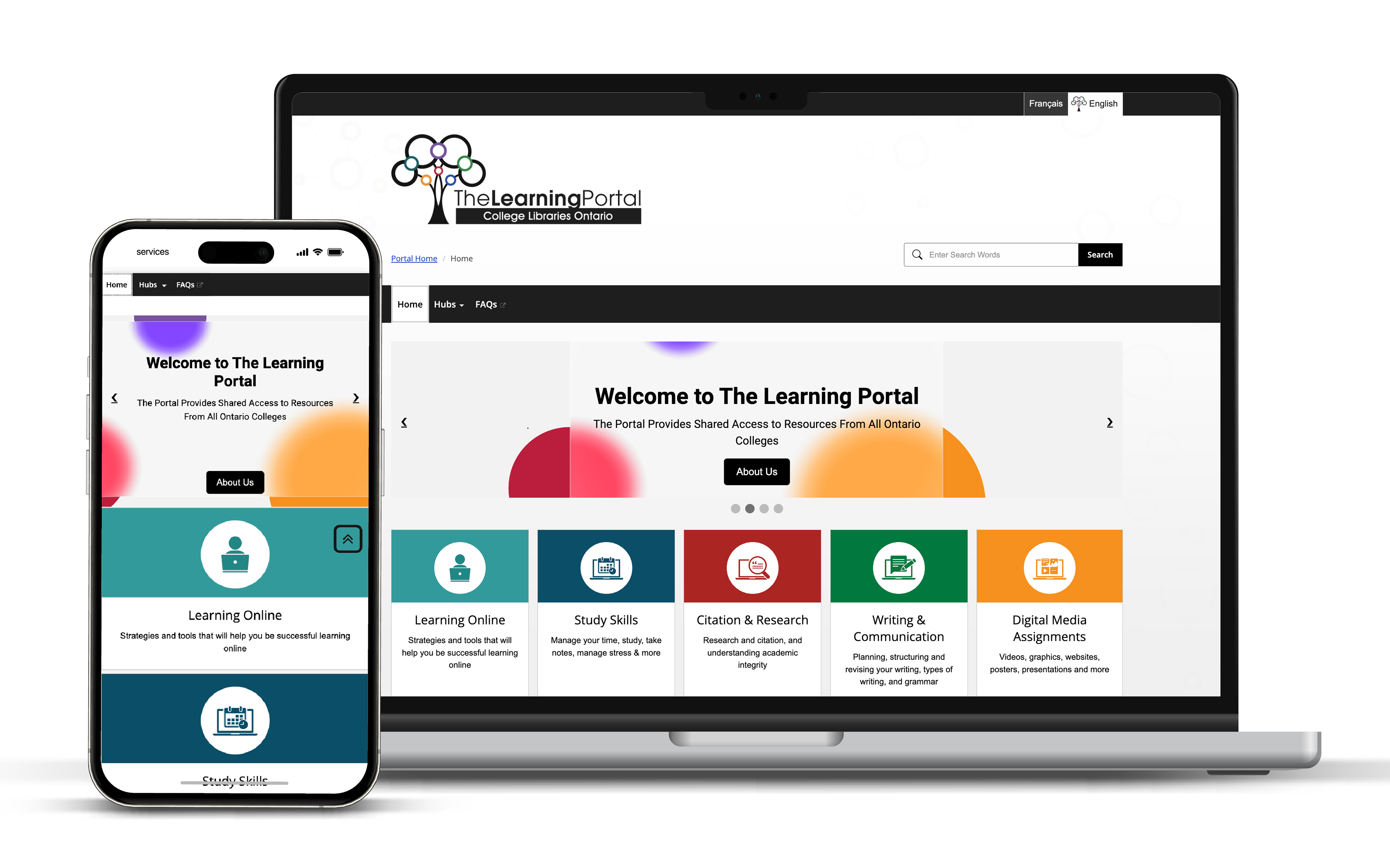
Simplified Menu Bar: Redesigned the menu bar from two lines to a single-line format, prioritizing high-traffic areas: Home, Hubs, and FAQs.
Evidence-Based Design Choices
• User Analytics: Showed that the majority of users frequently accessed the Home, Hubs, and FAQs sections, making these ideal choices for simplifying the menu.
• Usability Testing: Demonstrated that the one-line menu significantly reduced user confusion and improved navigation speed, enhancing the overall user journey.
Creating Visual Hierarchy:
Added clear visual hierarchy with distinct headers, improved font sizes, and ample white space to guide the user’s attention toward critical areas.
Introduced icons and visual cues to help users scan through the page more easily and identify key sections.
Add carousel hero banners:
Designed and implemented an engaging carousel banner to showcase key hubs with clear calls-to-action (CTAs) at the top of the page.
This dynamic feature increased user engagement by promoting visually appealing resources.
This dynamic feature increased user engagement by promoting visually appealing resources.
Content Reduction and Reorganization:
Removed redundant sections (e.g., Terms of Use), streamlining the page. Moved less critical elements to the About page, freeing up space for high-priority information like library resources.
Expanded the visibility of the college library to emphasize its importance as a resource hub, based on user behavior data.
Expanded the visibility of the college library to emphasize its importance as a resource hub, based on user behavior data.
Additionally, ensure that all design elements, including layout adjustments, maintain full responsiveness across various devices for a seamless user experience.